Project completed as a design challenge for a job interview. Short 3-day design challenge to redesign a Shaw Academy course information page. The project's aim was to increase usability and encourage more people to enrol.
The Problem: The page didn't look professional and new users struggled to trust it.
You can view the final prototype here, however, you have to imagine the box on the right sticking with you as you scroll!
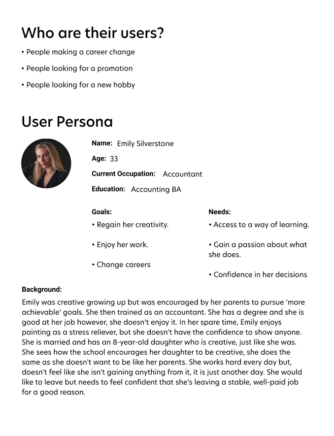
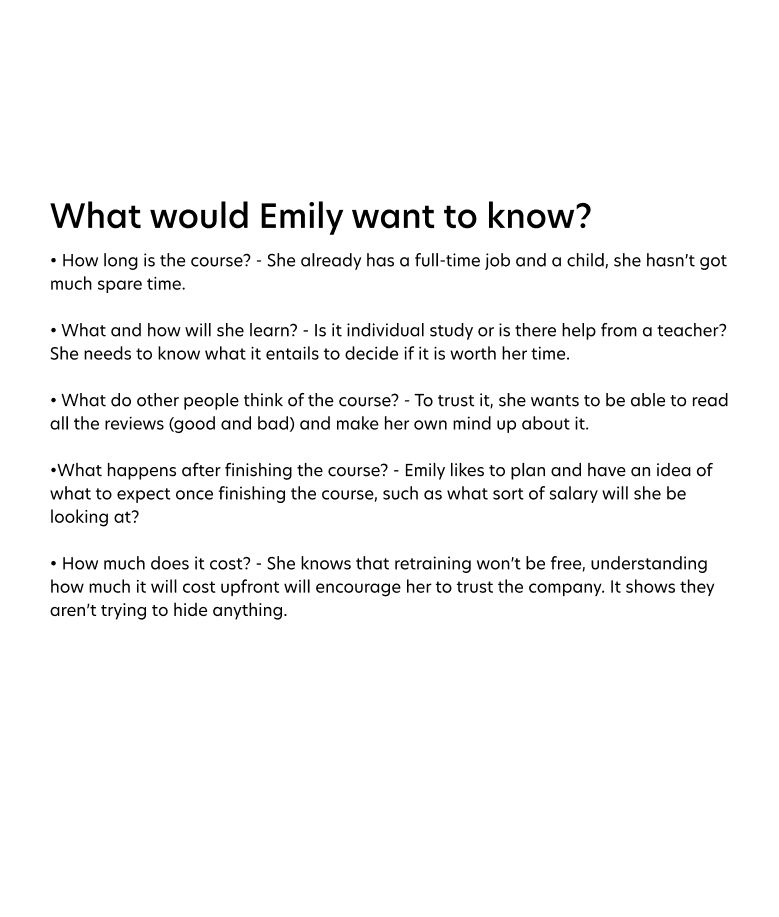
First Steps: Competitor research and user profiling. Analysing competitors' websites to look at what information they provide about their courses. Looking for gaps on Shaw's current page and what information might not be necessary. I created a User Persona called Emily who was looking to switch careers and thought about all the questions she might have regarding the course. I wanted to try and answer as many of those questions as I could with my design and then look at prioritising the information.
Next Steps: Initial design process using a wireframe. The information desperately needed re-organising, it's now easily digestible and visually interesting. There is an order which helps the user to find the information they are looking for.
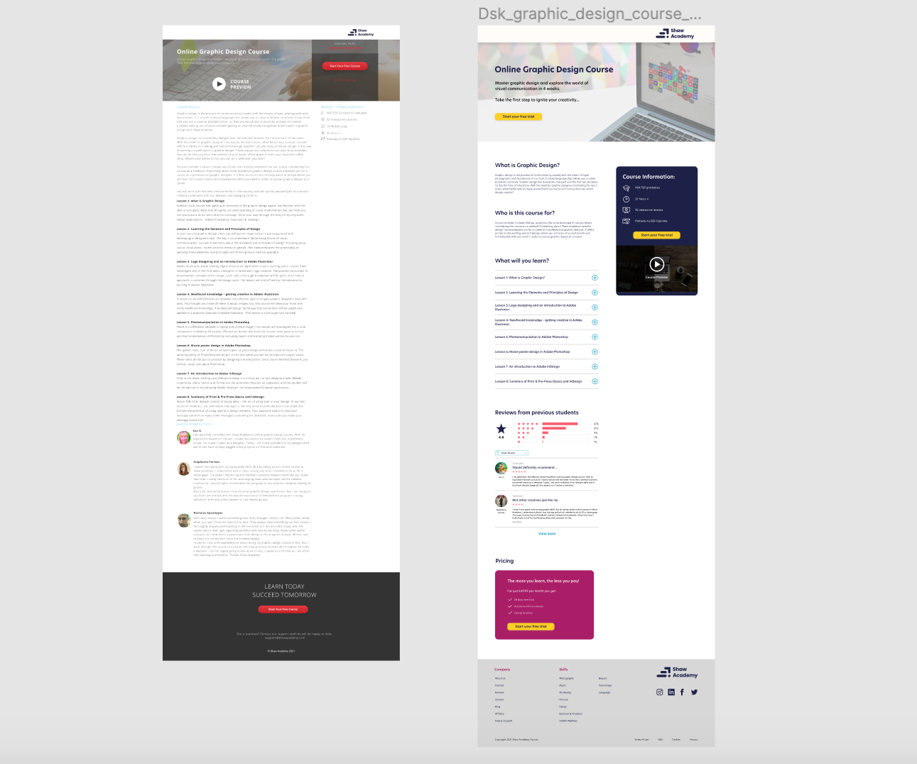
Initial design next to a screen-grab of the current design as a comparison. The design now has far more hierarchy and spacing.
Final steps: Looks good but a bit more tweaking is needed. Also one of the issues I gained from Emily was that she wanted to know what would happen after finishing the course so I added an area at the bottom of the page for the next steps.
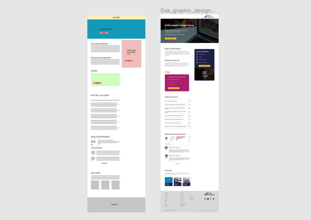
Latest design next to the wireframe I created.
The course information box on the right is information lifted from the current site but more bold and eye-catching. It moves with you as you scroll down the page so that you always have a CTA on the page.
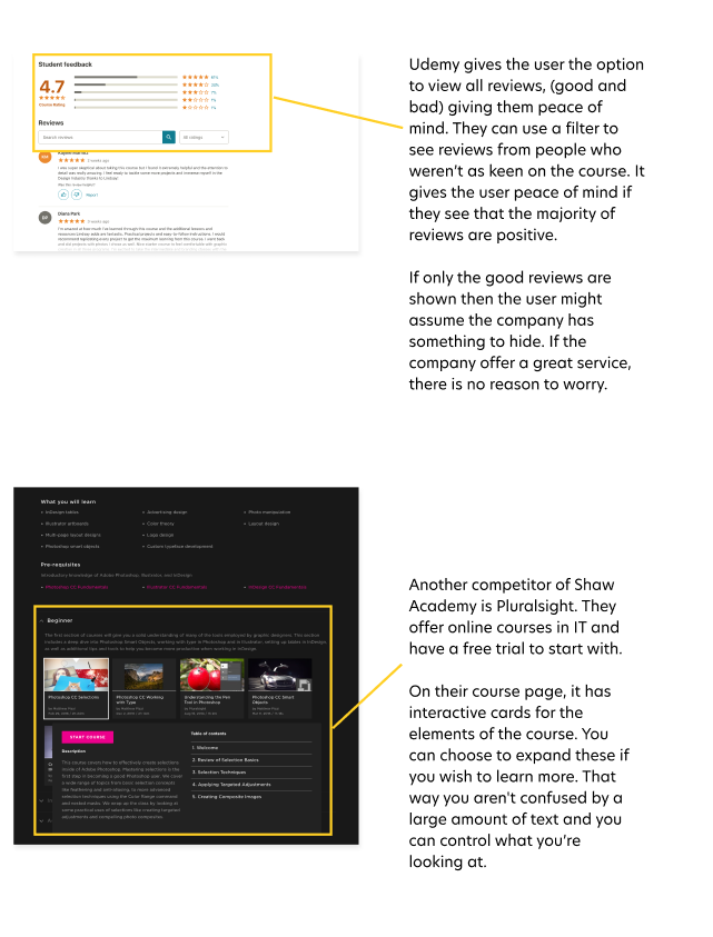
Including reviews from previous students, I got from adapting the “Success Stories” section on the current site. The star scoring system is used all over the internet and provides a visual aid to reviews. Within seconds a user can get a feel for the value of the course, which is one of the questions Emily wanted to be answered. Having all existing reviews on the site encourages trust in the course's quality as it can't be controlled by Shaw. This could be a motive for others to join.
Another motive to join could be the free trial so I moved the pricing section up to the top of the page. It states that it is only a trial and you will have to pay for it once it's over. This transparency should encourage users to trust the site and therefore engage with the brand.